
Should You Paint Your Brick House? Pros, Cons, and Best Practices

You’ve been staring at your brick house for years, and lately you’re wondering if a fresh coat of paint might transform its appearance. Maybe the brick color feels dated, or you’re drawn to those beautiful painted brick homes you see on design shows and social media. But you’ve also heard warnings that painting brick is a mistake you’ll regret. The truth is somewhere in between. Painting brick can dramatically improve your home’s curb appeal and update its look, but it’s also a significant commitment that changes your home’s maintenance requirements permanently. Once brick is painted, going back to exposed brick is extremely difficult and expensive. Understanding what painting brick really means—the benefits, drawbacks, costs, and long-term implications—helps you make an informed decision that’s right for your home and situation. The Permanence Factor Before diving into pros and cons, understand this critical point: painting brick is essentially permanent. While paint on wood siding or stucco can be relatively easily removed and replaced, paint penetrates brick’s porous surface deeply. Removing it requires sandblasting or chemical stripping that often damages the brick itself. This permanence means your decision affects not just your enjoyment of the home but also its future marketability. You’re committing to maintaining painted brick as long as you own the home and potentially limiting your buyer pool when you eventually sell. That said, many homeowners find painted brick beautiful and worth the commitment. The key is going into it with eyes wide open about what you’re taking on. Pros of Painting Brick Let’s start with the benefits that attract homeowners to painted brick. The most obvious advantage is aesthetic transformation. Painting brick can completely change your home’s appearance and curb appeal. Brick that’s orange, brown, or multicolored can become crisp white, sophisticated gray, or any color that suits your vision. Paint allows you to modernize dated brick styles. Brick popular in the 1970s or 1980s often feels dated now. A fresh coat of paint brings the home into current design trends. You gain incredible color flexibility that brick doesn’t offer. Want a coastal white cottage? A modern charcoal contemporary? A farmhouse with cream-colored brick? Paint makes these transformations possible. Painting can hide damaged or mismatched brick. If you’ve had repairs that used non-matching brick, or if your brick has staining or deterioration, paint covers these imperfections. For some homes, paint actually increases resale value by updating appearance and making the home more appealing to current buyers who prefer painted brick’s clean, modern look. In certain neighborhoods where painted brick is common and expected, painting might actually be necessary to fit in and maintain property values. Some government and municipal painting services include historic brick buildings where paint protects aging masonry while preserving the structure’s appearance. Cons of Painting Brick The drawbacks are significant and deserve serious consideration. Once painted, brick requires ongoing maintenance. Unpainted brick needs virtually no maintenance—occasional cleaning at most. Painted brick needs repainting every 10-15 years in Florida’s climate, sometimes sooner in harsh conditions. Paint traps moisture if not applied correctly. Brick is designed to breathe—moisture moves through it naturally. Paint that doesn’t allow this moisture transmission can trap water, leading to deterioration behind the paint film, mold growth, and structural damage over time. You lose brick’s natural character and texture. Many people find natural brick beautiful, and painting eliminates the depth, variation, and character that makes brick special. Removing paint later is extremely difficult and expensive. If you or future owners want exposed brick again, you’re looking at $10,000-$25,000+ for professional removal on a typical house, and the brick may be damaged in the process. Painted brick may limit your buyer pool when selling. While many buyers love painted brick, others specifically want natural brick. Your pool of potential buyers narrows. In Florida’s climate, painted brick faces challenges from humidity, intense sun, and occasional severe weather that can accelerate paint deterioration. For commercial properties requiring professional exterior painting services, brick painting decisions consider long-term building maintenance budgets and brand image requirements. When Painting Brick Makes Sense Despite the drawbacks, certain situations justify painting brick. If your brick is already damaged—severely stained, spalling (flaking), or deteriorating—paint can protect it from further damage while improving appearance. Paint actually extends the life of compromised brick in these cases. When brick color is extremely dated or unattractive (think 1970s orange-brown brick), and you plan to stay in the home long-term to justify the ongoing maintenance commitment, painting makes sense. If you’ve had brick repairs with non-matching replacement brick creating a patchwork appearance, paint provides visual uniformity. In neighborhoods where painted brick is the norm and unpainted brick would look out of place, painting maintains property values. When you’re doing comprehensive exterior updates and painted brick fits your overall design vision, it can be the right choice. If you’re committed to the maintenance and understand the permanence, and the aesthetic improvement brings you significant joy, paint your brick. Just do it properly with quality products and professional application. When to Keep Brick Natural Conversely, some situations strongly suggest keeping brick unpainted. If your brick is in good condition with attractive color and character, there’s little practical reason to paint. You’d be taking on maintenance for purely aesthetic reasons. When you might sell within 5-10 years, avoiding painted brick keeps your buyer pool wider. If you’re unsure about the commitment, don’t paint—you can always paint later, but you can’t easily unpaint. In historic districts or on historic homes where original brick is part of the home’s character and value, painting is usually a mistake. If moisture issues exist in your walls, painting brick could worsen problems by trapping moisture that currently evaporates through brick. When budget is limited, consider that painting brick properly costs $3,500-$15,000+ initially, then requires ongoing repainting expenses. Those funds might be better spent elsewhere. Preparation: The Foundation of Success If you decide to paint, preparation determines whether your painted brick lasts a decade or fails within a year. Start by addressing any moisture issues before painting. Fix
How to Paint Textured Walls and Ceilings in Florida Homes

Textured walls and ceilings are everywhere in Florida homes. From orange peel and knockdown finishes to popcorn ceilings and skip trowel patterns, these surfaces present unique painting challenges that smooth walls simply don’t have. The texture catches paint differently, hides coverage issues until it’s too late, and requires more material and different techniques than flat surfaces. If you’ve ever tried painting textured surfaces with the same approach you’d use on smooth walls, you’ve probably been frustrated by the results—streaky coverage, excessive paint usage, and a finish that somehow looks worse than when you started. Understanding how to work with texture rather than against it makes all the difference between amateur-looking results and professional finishes. Why Textured Surfaces Are Common in Florida Before diving into techniques, it’s worth understanding why texture is so prevalent here. Textured finishes hide imperfections in drywall installation and taping, which saves builders time and money during construction. In Florida’s humid climate, minor wall movement and settling are common—texture disguises the small cracks and irregularities that would be obvious on smooth walls. Acoustic or popcorn ceilings were popular for decades because they reduced noise transmission between rooms and hid ceiling imperfections. While less common in new construction, millions of Florida homes still have them. The challenge? All that helpful texture that hides flaws also makes painting significantly harder. The peaks and valleys create shadows, catch roller fibers, and use dramatically more paint than smooth surfaces. Understanding Different Texture Types Different textures require slightly different approaches. Orange peel texture is subtle with small, rounded bumps resembling orange skin. It’s one of the easier textures to paint and common in newer Florida construction. The texture is light enough that standard painting techniques work with minor modifications. Knockdown texture features flattened peaks with irregular patterns, creating more pronounced texture than orange peel but less aggressive than skip trowel. This medium-level texture is popular in Florida homes and requires careful attention to ensure paint reaches all the valleys. Skip trowel or Spanish lace creates heavy, irregular patterns with deep shadows and pronounced peaks. This artistic texture is common in Mediterranean and Spanish-style Florida homes. It’s beautiful but uses enormous amounts of paint and requires specific techniques for even coverage. Popcorn or acoustic ceiling texture has a bumpy, cottage cheese-like appearance. It’s the most challenging texture to paint because it’s fragile—vigorous rolling can knock texture loose—and it absorbs paint like a sponge. Many Florida homes built before 1990 have popcorn ceilings. Essential Tools for Textured Surfaces Standard painting tools don’t work well on heavily textured surfaces. You’ll need specific equipment designed for texture. Thick-nap rollers are essential—while smooth walls need 3/8″ nap, textured walls require 3/4″ to 1″ nap depending on texture depth. The thicker nap reaches into valleys and around peaks for complete coverage. High-quality roller frames that can handle the extra paint weight matter more than you’d think. Cheap frames flex under the weight of paint-saturated thick rollers, making application uneven. Extension poles save your shoulders and back when painting ceilings and upper walls, and they’re essential for textured surfaces where you’ll be working harder to achieve coverage. Sprayers work exceptionally well on heavily textured surfaces, providing even coverage that reaches every crevice. However, they require masking everything you don’t want painted and work best for whole-room or whole-house projects rather than single walls. Choosing the Right Paint Paint selection matters enormously for textured surfaces. You’ll need significantly more paint than for smooth walls—typically 30-50% more depending on texture depth. Budget accordingly or you’ll run out mid-project with noticeable differences between batches. Flat or matte finishes work best on textured walls. They hide the imperfections that texture was designed to conceal and don’t create sheen variations that highlight every peak and valley. Eggshell can work on light texture, but anything glossier amplifies texture irregularities. High-quality paint with good coverage properties saves money despite higher per-gallon costs. Premium paint’s better hiding power means fewer coats, which matters when texture is drinking up product. For heavily textured surfaces, one coat of premium paint often outperforms two coats of budget paint while using less material overall. Thick-bodied paints formulated specifically for textured surfaces are available and worth considering for heavy textures. These products are designed to bridge texture gaps and provide more uniform coverage with less product. Proper Surface Preparation Even textured surfaces need preparation before painting. Clean thoroughly to remove dust, cobwebs, and grime that accumulate in texture crevices. A vacuum with a brush attachment works well for popcorn ceilings and heavy wall texture. Follow with a damp cloth or sponge for sticky residues. Repair any damaged areas before painting. With knockdown or skip trowel texture, this might mean hiring a professional to match the texture pattern. Orange peel texture is easier to touch up with spray texture products available at hardware stores. For popcorn ceilings with water stains, use stain-blocking primer on affected areas before ceiling paint. The stains will bleed through regular paint no matter how many coats you apply. Prime any bare drywall or repairs—texture soaks up the first coat, so primer provides a sealed base that helps your finish paint perform better. Techniques for Painting Textured Walls The key to painting textured walls is working the paint into the texture rather than just rolling over the surface. Load your thick-nap roller generously with paint—more than seems reasonable. The texture will absorb it. Roll in multiple directions—up and down, then side to side, then diagonally if needed—to ensure paint reaches all the valleys and crevices. Use more pressure than you would on smooth walls, especially on the first coat. You’re trying to force paint into texture depths. However, don’t press so hard you damage the texture or create thin spots. Work in smaller sections than you would on smooth walls, perhaps 3×3 feet at a time. This keeps your wet edge manageable and gives you time to work paint into texture before it starts drying. Back-roll after each section—go over the area again lightly to even out the
Bold Accent Wall Ideas That Increase Home Value

An accent wall can completely transform a room’s character and energy. Done right, it adds visual interest, defines spaces, and creates focal points that buyers notice and appreciate. Done wrong, it becomes a polarizing feature that narrows your buyer pool and reduces appeal. The key difference? Strategic choices about color, placement, and execution. Bold doesn’t have to mean risky when you understand what today’s buyers respond to and how to create accent walls that enhance rather than detract from your home’s value. Why Accent Walls Can Increase Home Value A well-executed accent wall serves multiple purposes that appeal to potential buyers. It defines spaces in open floor plans without physical barriers, creates visual focal points that draw the eye strategically, adds personality and character without overwhelming the entire room, and demonstrates attention to design details that suggest a well-maintained home. In real estate terms, accent walls help buyers envision the space’s potential. They see a room with character and purpose rather than a blank box. This emotional connection drives offers and can influence final sale prices, especially in competitive markets. However, the value increase isn’t automatic. Generic or poorly chosen accent walls add nothing—or worse, subtract value by seeming dated or limiting the room’s versatility. The difference lies in strategic execution. Choosing Colors That Add Value Instead of Risk Bold doesn’t mean neon or shocking. The best accent wall colors make statements while maintaining broad appeal. Deep, sophisticated blues—think navy, deep teal, or midnight blue—top the list of value-adding accent colors. These shades feel current, work with multiple design styles, and photograph beautifully for listing photos. Rich charcoal or slate grays create dramatic contrast without the coldness of black. They ground spaces and provide sophisticated backdrops for artwork or furnishings. For interior painting projects focused on maximizing value, these deep neutrals deliver impact without polarizing potential buyers. Warm, earthy tones like terracotta, deep sage, or rich olive green connect to current design trends favoring natural, organic palettes. These colors feel fresh now but have staying power because they’re rooted in timeless natural hues. Jewel tones used judiciously—emerald green, sapphire blue, or deep burgundy—can work in the right spaces. Use them in smaller rooms like powder bathrooms, home offices, or reading nooks where the intensity feels intentional rather than overwhelming. Avoid trendy colors that date quickly—millennial pink, that specific shade of teal that dominated Instagram, or any color strongly associated with a particular year or trend. Also skip colors that are too personal or unusual, anything neon or fluorescent, pure black (too harsh for most homes), and extremely bright primaries that feel childish or overwhelming. Strategic Placement for Maximum Impact Where you place an accent wall matters as much as the color itself. The best accent walls occur behind beds in primary bedrooms, creating instant focal points and hotel-like sophistication. This placement works because it defines the sleeping area without overwhelming the room. In living rooms, the wall behind the sofa or TV creates natural gathering points and helps define conversation areas. This works especially well in open floor plans where defining distinct zones adds value. For office painting in home office spaces, the wall behind your desk creates professional Zoom backgrounds while maintaining focus. Architectural features deserve highlighting. Walls with fireplaces, built-in shelving, or unique architectural details benefit from accent color that draws attention to these value-adding features. The color emphasizes what makes the room special. Avoid placing accent walls on walls with multiple doors or windows—the interrupted space doesn’t showcase the color effectively. Don’t create accent walls in small rooms where dark colors make spaces feel cramped, and skip highly visible walls from main entries where bold color immediately confronts visitors before they’ve experienced the home. Techniques Beyond Solid Color Accent walls don’t have to be single solid colors. Modern techniques add dimension and interest while maintaining sophistication. Textured paint techniques like subtle color washing or Venetian plaster create depth without pattern. These work beautifully in formal spaces and photograph as high-end finishes. Two-tone walls with chair rail or picture rail molding add architectural interest and allow combining bold lower sections with neutral upper sections, or vice versa. This classic approach works in dining rooms and traditional homes. Horizontal or vertical striping in tonal variations—think three shades of blue or gray in varying widths—creates visual interest that feels custom rather than painted. This technique works particularly well in modern homes with clean lines. Geometric patterns using painter’s tape create modern, graphic statements. Keep patterns simple and use colors within the same family for sophistication rather than chaos. For kitchen cabinet painting paired with geometric accent walls in adjoining dining areas, coordinate colors for cohesive flow. Shiplap or board-and-batten accent walls painted in contrasting colors add texture and dimension. These work beautifully in coastal Florida homes and farmhouse styles that remain popular. Room-by-Room Accent Wall Strategies Different rooms call for different approaches. In primary bedrooms, deep blues, charcoal grays, or rich greens behind the bed create serene, hotel-inspired retreats. These colors photograph beautifully and appeal to buyers seeking relaxing sanctuaries. Living rooms benefit from sophisticated neutrals with personality—deep greige, warm charcoal, or soft navy. These anchor the space without overwhelming and work with various furniture styles potential buyers might have. Dining rooms can handle slightly bolder choices since they’re used less frequently. Deep burgundy, forest green, or rich navy create intimate, formal dining atmospheres that appeal to buyers who entertain. Home offices need colors that photograph well on video calls and maintain professional atmospheres. Deep blue, forest green, or charcoal gray provide polished backgrounds while adding character. For commercial painting of actual office spaces, these same principles apply to conference rooms and executive offices. Powder bathrooms offer opportunities for bolder statements since they’re small spaces guests use briefly. Dramatic wallpaper, deep jewel tones, or even black create memorable impressions without committing entire bathrooms to bold colors. Balancing Bold Choices With Neutral Foundations The most successful accent walls exist within predominantly neutral homes. This balance is crucial for maintaining value.
Coastal Color Palettes: Bringing Beach Vibes to Your Florida Home

Living in Florida means embracing coastal living, even if you’re miles from the beach. There’s something about soft blues, sandy neutrals, and ocean-inspired hues that feels perfectly at home in the Sunshine State. Whether you’re right on the water or inland, coastal color palettes create spaces that feel relaxed, airy, and unmistakably Floridian. Coastal colors aren’t just about painting everything navy and white—though that classic combination certainly works. Today’s coastal palettes are more sophisticated, drawing inspiration from seashells, driftwood, sea glass, coral reefs, and the ever-changing colors of ocean and sky. The key is creating a harmonious scheme that brings the outdoors in while maintaining a timeless appeal that won’t feel dated in a few years. Understanding Coastal Color Theory Coastal palettes work because they mirror the natural environment. When you’re at the beach, what colors do you see? Soft blues and greens of water, warm sandy beiges and taupes, weathered grays of driftwood, crisp whites of seafoam and clouds, and occasional pops of coral, turquoise, or seafoam green. These colors naturally complement each other because they exist together in nature. You can combine them confidently knowing they’ll create cohesive, peaceful spaces. The best coastal palettes use these colors in varying intensities—some soft and subtle, others slightly more saturated for accent. In Florida specifically, coastal colors work with our abundant natural light. Our sunshine is bright and warm, which means colors appear more vivid here than in northern climates. What looks perfect in a paint store might feel more intense once on your walls with Florida sun streaming through windows. Classic Coastal White and Cream White is the foundation of most coastal palettes, but not just any white. The best coastal whites have subtle warm or cool undertones that prevent that stark, sterile feeling. Colors like White Dove, Swiss Coffee, or Alabaster have just enough warmth to feel inviting while maintaining that crisp, clean coastal aesthetic. Creamy whites and soft ivories work beautifully as main wall colors throughout a home. They maximize light reflection, make rooms feel larger and airier, and provide the perfect backdrop for coastal-inspired furniture and décor. For interior painting in Florida homes, these warm whites adapt to our intense natural light without feeling cold or harsh. Trim painted in brighter white creates beautiful contrast against cream walls. This classic combination adds architectural interest and maintains that fresh, beachy feeling. For kitchen cabinet painting, white or cream cabinets paired with light countertops and coastal-inspired tile creates the quintessential Florida beach house kitchen. Soft Blues: From Sky to Sea Blue is synonymous with coastal design, but choosing the right blue matters. Avoid anything too bright or primary—coastal blues should feel soft and organic, not cartoonish. Pale sky blues like Palladian Blue or Beach Glass create serene bedrooms and bathrooms. These colors feel open and airy, perfect for spaces where you want to relax. They work especially well in rooms with good natural light, where they’ll shift throughout the day from soft blue-green in morning light to gentle periwinkle in afternoon sun. Medium blues with gray undertones—think colors like Anchor Gray or Sea Salt—work beautifully as accent walls or in spaces like home offices or living rooms. These shades feel sophisticated rather than themed, bringing coastal vibes without screaming “beach house.” Deeper navy blues provide dramatic contrast in coastal schemes. Use navy on interior doors, built-in bookcases, or as an accent wall behind a bed. Navy grounds lighter coastal colors and adds depth that prevents spaces from feeling washed out. For exterior painting, soft blue-gray combinations create classic coastal curb appeal that looks at home throughout Florida. Pair a soft blue-gray body color with white trim and a navy or slate door for timeless coastal elegance. Soothing Greens: Sea Glass and Sage Coastal greens range from soft sage to pale aqua, each bringing different energy to spaces. Sea glass greens—those beautiful blue-greens reminiscent of weathered glass found on beaches—create incredibly peaceful spaces. Colors like Rainwashed or Watery work beautifully in bathrooms, creating spa-like atmospheres that feel connected to the ocean. Soft sage greens bring coastal warmth without the coolness of blue. These colors work particularly well in Florida because they complement our lush tropical landscaping. A soft sage exterior with white trim and natural wood accents creates a home that feels both coastal and integrated with Florida’s green environment. Pale aqua or turquoise works as accent colors rather than main wall colors. Use these brighter greens on interior doors, in powder rooms, or for cabinet painting in a beach house laundry room or butler’s pantry. They add personality and coastal energy without overwhelming spaces. Warm Neutrals: Sand, Driftwood, and Stone Neutrals ground coastal palettes and prevent them from feeling too cool or monochromatic. The best coastal neutrals mimic natural elements found at the beach. Sandy beiges and taupes bring warmth while maintaining that light, airy coastal feeling. Colors like Accessible Beige, Balanced Beige, or Sand Dollar work throughout homes as main wall colors. They’re forgiving, work with various lighting conditions, and provide warmth that balances cooler coastal blues and greens. Weathered gray neutrals—colors that look like sun-bleached driftwood—create sophisticated coastal spaces. These grays have brown or taupe undertones rather than blue or purple, keeping them warm and organic. Use them in living areas, bedrooms, or as exterior painting colors for a modern coastal aesthetic. Greige tones, those perfect blends of gray and beige, are coastal workhorses. They literally go with everything in a coastal palette and create cohesive flow in open floor plans common in Florida homes. Creating Your Coastal Palette Building a coastal color scheme means choosing colors that work together harmoniously. Start with a base neutral—white, cream, or soft greige—for most walls. This creates your canvas and keeps spaces feeling light and open. Add one or two coastal accent colors for interest. Perhaps soft blue in bedrooms and sea glass green in bathrooms. Or use varying shades of the same color family throughout—different blues in different intensities across different rooms. Include a deeper accent for grounding.
Popcorn Ceiling Removal and Painting: What Florida Homeowners Should Know

Walk into most Florida homes built between the 1950s and 1990s, and you’ll likely see them—popcorn ceilings with that bumpy, textured surface that once seemed like a good idea. Also called acoustic ceilings or cottage cheese ceilings, these textured surfaces were popular for decades because they hid imperfections, provided some sound dampening, and were quick to apply during construction. But times have changed. Today’s homebuyers and homeowners overwhelmingly prefer smooth, modern ceilings. Popcorn texture makes rooms feel dated, collects dust and cobwebs, and is nearly impossible to clean. If you’re considering removing that popcorn texture, you’re not alone—it’s one of the most requested home updates in Florida. Before you grab a scraper and start working, there are important things you need to know, especially if your home was built before 1980. The Asbestos Issue You Can’t Ignore Here’s the critical safety concern: popcorn ceiling texture applied before the mid-1980s often contains asbestos fibers. Asbestos was added to ceiling texture because it strengthened the material and provided fire resistance. The problem? Asbestos is extremely hazardous when airborne fibers are inhaled, causing serious lung diseases and cancer. If your home was built before 1980, you must assume your popcorn ceiling contains asbestos until proven otherwise. Do not attempt removal yourself. Even homes built in the early 1980s might have asbestos-containing texture if builders used up old stock of materials. The only way to know for certain is professional asbestos testing. A small sample is sent to a lab for analysis, with results typically available within a week. Testing costs $50-150 per sample and is money well spent for your safety. If asbestos is present, removal requires licensed asbestos abatement professionals who follow strict safety protocols. This significantly increases costs—often $3-7 per square foot compared to $1-3 per square foot for non-asbestos removal. However, there’s no safe way to DIY asbestos removal, and doing so is illegal in Florida. For homes built after 1990, asbestos is unlikely but not impossible. When in doubt, test. Your health is worth far more than the testing cost. Removal vs. Covering: Your Two Main Options Once you’ve confirmed your ceiling is asbestos-free, you have two approaches: complete removal or covering the texture. Removal involves spraying the ceiling with water to soften the texture, then scraping it off. This is messy, labor-intensive work that creates enormous amounts of debris. You’ll need to protect floors and furniture completely, and cleanup is substantial. After scraping, the ceiling requires skim coating to create a smooth surface, sanding, priming, and painting. Covering the texture means installing a new layer of drywall directly over the existing popcorn ceiling. This avoids the mess of removal but reduces ceiling height by about half an inch and requires careful work around light fixtures and ceiling fans. The advantage is that it’s cleaner and often faster than removal. The DIY Reality Check Removing popcorn ceiling is physically demanding, extremely messy, and more difficult than it appears. If you’re considering DIY, be honest about several factors. The physical demands are substantial—you’ll spend hours working overhead with your arms raised, which is exhausting. One room can take an entire weekend for a novice. The mess is incredible—wet texture falls everywhere despite your best efforts with drop cloths, and dust from sanding afterward gets into everything. Results often disappoint DIYers. Achieving a perfectly smooth ceiling requires skill in skim coating and sanding. Most homeowners end up with visible imperfections, waves, or texture differences that bother them every time they look up. Many eventually hire professionals to fix their DIY attempts, spending more overall than if they’d hired pros from the start. When Professional Help Makes Sense Professional popcorn ceiling removal makes sense in most situations. Pros complete the work faster with better results, handle asbestos testing and abatement if needed, have specialized equipment that minimizes mess, and deliver smooth, professional finishes. For whole-house projects, multiple rooms, or homes with asbestos concerns, professional services aren’t just recommended—they’re essential. Commercial projects like office painting that include ceiling updates almost always require professional work to meet building codes and appearance standards. The Process: What to Expect Understanding the process helps set realistic expectations whether you hire pros or attempt DIY on a confirmed asbestos-free ceiling. First, everything must be removed from the room—furniture, decorations, fixtures if possible. Floors and walls get protected with heavy plastic sheeting taped securely. The ceiling is sprayed with water to soften the texture, though some stubborn areas may need multiple applications or longer soaking time. Scraping involves systematically working across the ceiling with a wide scraper, removing the softened texture. This step creates most of the mess. After scraping, the underlying drywall is assessed for damage, holes are patched, and the entire surface receives skim coating—applying thin layers of joint compound to create smoothness. Once dry, the ceiling is sanded smooth, which creates fine dust that penetrates everywhere despite containment efforts. After cleaning, primer is applied followed by ceiling paint. The entire process for one room takes 3-5 days including drying time. Painting Your Newly Smooth Ceiling Once texture is removed and the surface is smooth, proper painting ensures beautiful, lasting results. Ceiling paint differs from wall paint—it’s formulated to minimize drips and provides better hiding power for the slight imperfections that remain even after careful finishing. Most ceilings look best in flat white, which hides minor flaws and reflects light beautifully. If your ceiling has stains or previous water damage, use stain-blocking primer before finish paint. For kitchen cabinet painting projects paired with ceiling updates, coordinating the timing creates a complete kitchen transformation with minimal disruption. Two coats of quality ceiling paint typically provide even coverage and color. Don’t skimp on paint quality—cheap ceiling paint requires more coats and still may not hide imperfections well. Cost Expectations for Florida Homes Professional popcorn ceiling removal in Florida typically costs $1-3 per square foot for asbestos-free ceilings, or $3-7 per square foot if asbestos abatement is required. A standard 12×12 room runs $300-800 for removal, finishing, and painting
Why Is My Interior Paint Bubbling? Common Causes and Solutions

You just finished painting your living room or hired professionals to give your home a fresh look, and everything seemed perfect. But now, weeks or months later, you notice unsightly bubbles forming on your walls. It’s frustrating, it looks unprofessional, and you’re wondering what went wrong. Paint bubbling, also called blistering, is more common than you think, especially in Florida’s humid climate. The good news? Once you understand what causes it, you can fix it and prevent it from happening again. What Causes Paint to Bubble? Paint bubbles form when the paint film loses adhesion to the surface underneath. Instead of lying flat, the paint lifts away from the wall, trapping air or moisture underneath. Several factors can trigger this problem, and identifying the root cause is the first step toward a lasting solution. Moisture Is the Main Culprit In Florida, moisture is enemy number one when it comes to paint problems. When water gets trapped between the paint and the wall surface, it creates pressure that pushes the paint outward, forming bubbles. This moisture can come from several sources. High humidity levels in bathrooms, kitchens, and laundry rooms create the perfect environment for paint bubbling. If you notice bubbles in these areas, moisture is likely the cause. Water leaks from pipes, roofs, or windows can also seep into walls and cause paint to blister. Sometimes the problem isn’t visible until the paint starts bubbling. Interior painting in Florida homes requires special attention to moisture control. Proper ventilation and addressing any water intrusion issues before painting are essential steps that professional painters always take. Painting Over Dirty or Greasy Surfaces Paint needs a clean surface to adhere properly. If walls weren’t cleaned before painting, dirt, dust, grease, or soap residue can prevent the paint from bonding correctly. This is especially common in kitchens where cooking grease accumulates on walls, or in bathrooms where soap scum builds up. When paint can’t grip the surface, it eventually lifts and forms bubbles. This is why professional painting services always include thorough surface preparation as part of the process. Applying Paint in Poor Conditions Temperature and humidity matter when you’re painting. If paint is applied when it’s too hot, too cold, or too humid, it won’t cure properly. In Florida’s climate, painting during the hottest part of the day or in rooms with poor air circulation can cause problems. Direct sunlight hitting freshly painted walls can also cause the outer layer to dry too quickly while the layer underneath is still wet, trapping moisture and creating bubbles. Painting Over a Wet Surface This seems obvious, but it happens more often than you’d think. If the previous paint layer, primer, or the wall itself hasn’t fully dried before applying the next coat, moisture gets trapped. This is particularly problematic after cleaning walls or dealing with water damage. Using Low-Quality Paint or Wrong Paint Type Not all paints are created equal. Cheap paint often lacks the proper binders and resins needed to create a durable, flexible film. In Florida’s challenging environment, using quality paint makes a significant difference in longevity and appearance. Using the wrong type of paint for the surface or room conditions can also cause bubbling. For example, using flat paint in a bathroom or kitchen where moisture and humidity are constant issues is asking for trouble. How to Fix Bubbling Paint If you’re already dealing with paint bubbles, here’s what you need to do. The fix isn’t complicated, but it does require some work and patience. First, you’ll need to remove the bubbled paint. Use a scraper or putty knife to carefully scrape away all the loose, bubbling paint. Don’t just paint over it—the problem will only get worse. Once you’ve removed the damaged paint, sand the area smooth so there are no rough edges. You want a seamless transition between the existing paint and the bare wall. Next, address whatever caused the bubbling in the first place. If it was moisture, fix the leak or improve ventilation. If it was poor surface prep, clean the area thoroughly with a degreaser and let it dry completely. This step is crucial—skip it and the bubbles will return. Apply a primer designed for your specific situation. If moisture was the issue, use a moisture-resistant or stain-blocking primer. Let it dry completely according to the manufacturer’s instructions. Then repaint the area using quality paint suitable for the room’s conditions. Apply thin, even coats rather than one thick coat, and allow proper drying time between coats. Preventing Paint Bubbles in the Future Prevention is always easier than repair. If you’re planning any painting project, whether it’s a single room or your entire home, take these steps to avoid bubbling. Always prepare surfaces properly by cleaning walls thoroughly and repairing any damage before painting. Address moisture issues by fixing leaks, improving ventilation, and using exhaust fans in bathrooms and kitchens. Choose the right paint for each room—use moisture-resistant paint in high-humidity areas. Pay attention to weather conditions and avoid painting in extreme heat, cold, or humidity. Allow adequate drying time between coats, even if you’re eager to finish the project. And perhaps most importantly, consider hiring professionals who understand Florida’s unique climate challenges and know how to prepare and paint surfaces correctly the first time. Professional painters have the experience to identify potential problems before they start and use techniques that prevent common issues like bubbling. When you invest in quality workmanship, you get results that last. When to Call the Professionals Some paint bubbling is easy to fix yourself, but certain situations call for professional help. If bubbling is widespread throughout your home, if you suspect water damage behind the walls, if bubbles keep returning after you’ve fixed them, or if you’re dealing with textured walls or special finishes, it’s time to bring in the experts. Professional painting services can assess the underlying cause, properly prepare surfaces, and use the right products and
Cabinet Painting vs. Replacement: Which Is More Cost-Effective?

Your kitchen cabinets are looking tired and outdated. Maybe the finish is chipped, the color doesn’t match your style anymore, or they just feel stuck in the wrong decade. You know something needs to change, but you’re facing a big question: should you paint your existing cabinets or replace them entirely? It’s a decision that affects both your wallet and your daily life. Replacement sounds appealing—brand new cabinets with modern features and fresh design. But the price tag can be shocking. Painting seems more affordable, but will it really give you the transformation you’re hoping for? Let’s break down the real costs, benefits, and considerations so you can make the smartest choice for your home. The Cost Difference Is Significant Here’s the bottom line: cabinet painting costs a fraction of full replacement. Professional cabinet painting typically ranges from $3,000 to $8,000 for an average-sized kitchen, depending on the number of cabinets, their condition, and the quality of paint used. This includes proper preparation, multiple coats of durable paint, and professional-grade finishes. Cabinet replacement, on the other hand, can easily run $15,000 to $40,000 or more. Custom cabinets push costs even higher. You’re not just paying for the cabinet boxes and doors—you’re also paying for demolition, disposal, installation, possible plumbing and electrical adjustments, and often unexpected issues that pop up once old cabinets are removed. That’s a difference of tens of thousands of dollars. For many homeowners, especially in Florida’s competitive real estate market, putting that money toward other home improvements or keeping it in savings makes more financial sense. When Cabinet Painting Makes Perfect Sense If your cabinets are structurally sound, painting them is almost always the smarter choice. Solid wood cabinets from the 1990s or early 2000s were often built better than many new builder-grade options available today. The bones are good—they just need a cosmetic update. Kitchen cabinet painting can completely transform your space in a matter of days, not weeks. There’s minimal disruption to your daily routine. Professional painters can often complete the job while you continue using your kitchen, working around your schedule. The environmental impact matters too. Keeping existing cabinets out of landfills and avoiding the manufacturing footprint of new cabinets is a more sustainable choice. In an era where we’re all trying to be more conscious about waste, this consideration carries weight. Cabinet painting also offers incredible flexibility with color choices. Want to go from dark oak to crisp white? Prefer a trendy navy or sage green? Considering a two-tone look with different colors for upper and lower cabinets? Paint gives you options that would cost significantly more with replacement. When Replacement Might Be Worth Considering Painting isn’t always the answer. If your cabinets are falling apart, have extensive water damage, or feature a layout that doesn’t function well for your needs, replacement might be justified. Particle board cabinets that are swelling or deteriorating from moisture exposure won’t hold paint well and aren’t worth saving. If cabinet doors are warped, drawer boxes are broken, or the structure is compromised, you’re better off starting fresh. Sometimes the cabinet layout itself is the problem. If you need more storage, want deeper drawers, or dream of modern features like soft-close hinges and pull-out organizers, painting won’t solve these functional issues. Replacement gives you the opportunity to redesign the entire space. However, there’s a middle ground many homeowners don’t consider: painting existing cabinet boxes while replacing only the doors and drawer fronts. This hybrid approach updates the look and can add some modern features while keeping costs more manageable than full replacement. The Quality Factor: Why Professional Painting Matters Here’s something important to understand: the success of cabinet painting depends almost entirely on the quality of the work. A DIY job or a quick spray from an inexperienced painter will look terrible in a few months. Peeling, chipping, and a surface that feels rough or sticky are common complaints from homeowners who tried to cut corners. Professional cabinet painters know that proper preparation is everything. Cabinets need to be thoroughly cleaned to remove grease and cooking residue. All surfaces must be sanded to create proper adhesion. Hardware should be removed, not painted around. The right primer must be used for the cabinet material. Multiple thin coats of high-quality paint are applied, not one thick coat that will eventually crack. The finish matters too. Kitchen cabinets take serious abuse from daily use. They need a durable, washable finish that can handle moisture, grease splatters, and constant touching. Professional painting services use commercial-grade products specifically designed for cabinetry, not just regular wall paint. What About Timing? If you’re planning to sell your home soon, cabinet painting offers an excellent return on investment. Updated kitchens sell homes, and fresh, modern-looking cabinets make a strong impression on potential buyers. You’ll recoup most or all of your painting investment through a quicker sale and potentially higher offers. For homes you plan to stay in long-term, both options can make sense depending on your goals and budget. Paint can last 10-15 years with proper care, giving you plenty of time to save for eventual replacement if desired. Or you might find that your painted cabinets continue to serve you beautifully for decades. Making Your Decision Start by honestly assessing your cabinets’ condition. Open every door, check the drawer boxes, look for signs of damage or structural issues. If everything is solid, painting is likely your best bet. Consider your budget realistically. Yes, new cabinets are appealing, but is that $25,000 better spent elsewhere? Could you paint the cabinets now and use the savings to update countertops, backsplash, or appliances for a complete kitchen transformation at half the cost of cabinet replacement alone? Think about your timeline. Need results quickly? Cabinet painting can be completed in a week or less. Full replacement typically takes several weeks and leaves your kitchen unusable during much of that time. The Bottom Line For most homeowners with solid, functional cabinets, professional painting is absolutely the more cost-effective choice.
Best Neutral Paint Colors That Increase Home Value in 2026

Planning to sell your home soon? Or maybe you just want to make sure your paint choices protect your investment? The colors you choose for your walls have a bigger impact on your home’s value than you might think. Neutral paint colors are the safest bet when it comes to maximizing your home’s appeal and resale value. They create a blank canvas that helps potential buyers envision their own furniture and style in the space. But “neutral” doesn’t mean boring—and not all neutrals are created equal. Some neutral shades feel fresh and modern, while others can make your home look dated or drab. Choosing the right neutrals in 2026 means understanding current trends while selecting colors that won’t feel outdated in a few years. Why Neutral Colors Increase Home Value Real estate agents consistently report that homes painted in neutral colors sell faster and often for more money than homes with bold or personalized color schemes. There’s solid reasoning behind this. Neutral colors appeal to the widest audience of potential buyers. While you might love your deep purple bedroom or bright yellow kitchen, those bold choices can turn off buyers who see them as extra work they’ll need to undo. When buyers walk into a home with neutral walls, they’re not distracted by colors they dislike—they’re focused on the space itself, the layout, the natural light, and how they’d use each room. Interior painting with the right neutral palette creates a sense of cleanliness, spaciousness, and move-in readiness. Buyers perceive neutral homes as better maintained, even if that’s not necessarily true. It’s about perception and emotional response, which drive real estate decisions more than logic does. For Florida homes specifically, the right neutrals also complement our natural environment. Colors that work with abundant sunshine, beach-inspired aesthetics, and tropical landscapes feel appropriate and attractive to buyers in our market. The Top Neutral Paint Colors for 2026 Let’s talk about specific colors that are performing well in today’s market. These aren’t your builder-beige standards from twenty years ago—they’re sophisticated neutrals that feel current without being trendy. Warm Whites and Creamy Tones Pure stark white is out. Today’s buyers prefer warm whites with subtle undertones that add depth and warmth to a space. Think colors like Swiss Coffee, White Dove, or Alabaster. These aren’t yellow or cream in an obvious way, but they have enough warmth to prevent that cold, sterile hospital feeling. Warm whites work beautifully in Florida homes because they balance our intense natural light. They make rooms feel bright and airy without the harsh glare that pure white can create. These shades work in every room, from living areas to bedrooms to kitchen cabinet painting projects. Greige: The Perfect Middle Ground Greige—that perfect blend of gray and beige—continues to dominate the neutral palette. Colors like Agreeable Gray, Repose Gray, and Edgecomb Gray are incredibly popular because they work with virtually any décor style and color accent. The beauty of greige is its versatility. It reads neutral enough to appeal to everyone, but it has more character than plain beige. In open floor plans, which are common in modern Florida homes, greige creates cohesive flow between spaces. It’s sophisticated without being cold, warm without being dated. Soft Grays with Warm Undertones Cool, blue-toned grays are fading in popularity, but warm grays are still going strong. The key is choosing grays with brown or green undertones rather than blue or purple undertones. Colors like Accessible Beige, Balanced Beige, and Revere Pewter fall into this category. These warm grays feel modern and fresh while maintaining that neutral appeal buyers want. They’re particularly effective in office painting projects or home offices where you want a professional, focused atmosphere without cold sterility. Earthy Beiges and Taupes Classic beige isn’t dead—it’s just evolved. Today’s best-selling beiges are more sophisticated than the builder beige of decades past. Look for colors with depth and complexity, shades that shift slightly in different lighting conditions. Colors like Khaki Shade, Latte, and Natural Tan create warm, inviting spaces that feel both timeless and current. These work especially well in Florida homes with Mediterranean, Spanish, or traditional architectural styles. Colors to Avoid Just as important as knowing what works is understanding what doesn’t. Some colors can actually hurt your home’s value or appeal. Avoid anything too cool or gray without warm undertones—these can feel depressing or institutional, especially in rooms without much natural light. Skip trendy colors like millennial pink, bold jewel tones, or that trendy green-gray that was everywhere a few years ago. What’s trendy now will date your home quickly. Stay away from colors that are too dark or dramatic unless you’re working with a designer who understands how to balance them. Dark accent walls might work in your personal home, but they reduce perceived space and can turn off buyers. And please, skip the pure white. It’s too stark, shows every mark and scuff, and feels cold in most spaces. Those warm whites mentioned earlier will serve you much better. Room-by-Room Neutral Strategy Not every room needs to be painted the same neutral. A thoughtful approach uses variations of your chosen neutral palette throughout the home. Living areas and main spaces benefit from those warm whites or light grieges that maximize light and create an open feeling. These are your high-impact areas where first impressions form. Bedrooms can go slightly deeper or warmer, using colors like soft taupes or warm grays that create a cozy, restful atmosphere. Kitchen cabinet painting deserves special consideration. White or off-white cabinets continue to offer the best return on investment, though light greige cabinets are gaining popularity. The key is choosing a shade that works with your countertops and flooring. Bathrooms should feel clean and spa-like. Stick with lighter neutrals here, though you can go slightly cooler in tone since bathrooms typically have good lighting and the cooler tone can feel refreshing. For exterior painting, neutrals also reign supreme. Warm whites, soft grays, beiges, and taupes all perform well. Consider your home’s architectural
Need a Fresh Coat of Paint? 5 Signs You Need to Paint a Home

Deciding to refresh your living space with new paint is more than a cosmetic choice. It’s an opportunity to bring new life into your home and create an atmosphere that feels both renewed and personal. The moment you walk into a freshly painted room, you can feel the difference. The colors look vibrant, the walls feel cleaner, and the entire space gives off an energy that’s hard to ignore.
How to Plan for an Interior Painting Project
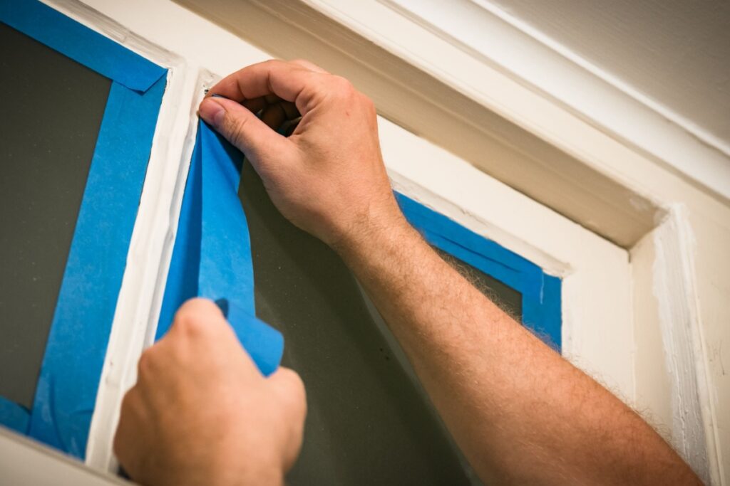
Deciding to revitalize your living space with a fresh coat of paint is a significant first step toward transforming your house into the home of your dreams. While our seasoned experts at Five Seasons Painting handle the complexities of the craft, your collaboration in the planning phase is paramount to achieving a truly unique and flawless result. For example, having a clear vision for the colors and overall design you wish to achieve in each room before a consultation allows for a more productive and nuanced discussion. And taking the time to move fragile items and declutter your space before the scheduled painting day helps everything progress without delay. Below, our comprehensive guide will walk you through the essential steps of preparing for your interior painting project so that the entire process is an effortless and rewarding experience. Plan Out Your Budget A detailed budget empowers you to make informed decisions without compromise. After all, it’s important to note that the cost of a premium painting service extends beyond just the paint itself; it encompasses the superior materials, the meticulous preparation, and the unparalleled skill of the artisans who will be bringing your vision to life. For this reason, you will want to formulate a budget based on the following factors: During your consultation with Five Seasons Painting, we provide a transparent and detailed estimate, breaking down all associated costs so you have a complete understanding of your investment. Choose the Right Paint Color The color of your walls is the canvas upon which your home’s entire aesthetic is built. It sets the mood and even influences how large and open the room appears. Therefore, selecting the perfect color is critical and deserves a great deal of your attention during the preparatory phase. Gather Inspiration Before you begin looking at paint swatches, seek inspiration from the world around you. Collect images from design magazines, architectural publications, and online platforms like Pinterest and Houzz. Do you gravitate toward the serene, muted tones of a coastal landscape or the bold, dramatic hues of a modern art piece? Creating a mood board can help you and your design consultant visualize a cohesive palette that flows elegantly throughout your home. Understand Color Psychology Color has a profound psychological impact. Understanding this can help you create spaces that not only look beautiful but also feel right. For example, if you choose soft blues and greens for bedrooms and bathrooms, you can create a calm retreat. If you want to foster a welcoming, energetic atmosphere, consider warm hues like light yellows or terracotta. Alternatively, you can add a layer of drama and intimacy to your living space with deep hues like charcoal or navy. Our painters will help you set the perfect mood with the right paint color for each room in your home. Consider the Elements of the Room Consider your room’s lighting — both natural and artificial — as it will dramatically affect how a color appears throughout the day. And don’t forget to take into account your flooring, cabinetry, countertops, and furniture. The goal is to create a unified and intentional design scheme where the wall color complements and enhances the other features of the room. Select the Perfect Sheen The paint’s sheen, or finish, affects both its appearance and its durability, so don’t forget to evaluate whether you prefer a matte, eggshell, satin, semi-gloss, or high-gloss finish while picking out your paint colors. Declutter Your Space To ensure our team can work efficiently and deliver the pristine results you expect, we recommend decluttering the rooms scheduled for painting. Remove small decorative items, picture frames, books, and any non-essential objects from shelves, tables, and walls. Consider this an opportunity to edit your decor, deciding what to keep, store, or donate. A simplified space will not only facilitate the painting process but will also allow the new wall color to truly shine once the project is complete. Safeguard Your Valuables Before our team arrives, please take the time to move any fragile or irreplaceable items to a secure, separate room that is not being painted. This includes antiques, artwork, crystal, and any delicate decor. While our painters are exceptionally careful, taking this proactive step provides an additional layer of protection and peace of mind for everyone involved. For larger furniture pieces, our team will carefully move them to the center of the room and cover them with premium-grade protective sheeting. Make Plans for Your Children and Pets For the safety and comfort of your family, it is wise to make arrangements for children and pets on painting day, as the presence of ladders and equipment can pose potential hazards. Consider arranging for them to stay with a friend or family member, or dedicate a space in the house far from the work zone that will keep them safe and allow our team to focus entirely on the task at hand. How the Five Seasons Painting Team Prepares for a Flawless Interior Paint Job On the day of your project, our team of professional painters arrives ready to execute your vision with precision and care. After all, preparation is the secret to a flawless finish. Protecting Your Home Our first priority is the protection of your home and belongings. We will lay down clean, high-quality drop cloths to protect all flooring in and around the work area. We will also move any large furniture to the center of the room and completely cover each piece with clean plastic sheeting. Once this is done, our painters remove all switch plates and outlet covers and mask off all trim, baseboards, light fixtures, window frames, and door frames to guarantee clean lines and no drippings. Surface Preparation Next, our artisans conduct a detailed inspection of every wall and ceiling to identify any imperfections. If found, we will fill in the holes or cracks in the drywall, and then sand all surfaces to an exceptionally smooth and uniform state. We even caulk gaps in trim and molding to